Case Study
Elsevier - Knovel
As engineering problems become increasingly complex and data proliferates at an astonishing rate, research engineers relying on a few trusted handbooks and searchable reference database is no longer enough.
Case Study
As engineering problems become increasingly complex and data proliferates at an astonishing rate, research engineers relying on a few trusted handbooks and searchable reference database is no longer enough.

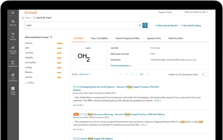
Knovel’s new redesigned user experience accelerates your discovery of answers and insights from technical reference content sourced from over 140+ providers — so you can quickly tap into must-have resources like Patty’s Toxicology and Yaws’ Critical Property Data for Chemical Engineers and Chemists and discover more insights from other trusted and specialized sources like ASM International and NACE.

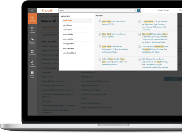
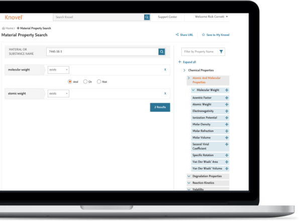
Knovel’s design offers new data discovery and search capabilities that let you easily perform data-related searches and narrow down your queries into more targeted results — so you can more immediately find and apply engineering equations, graphs, tables and validated data points to solve your operational challenges.

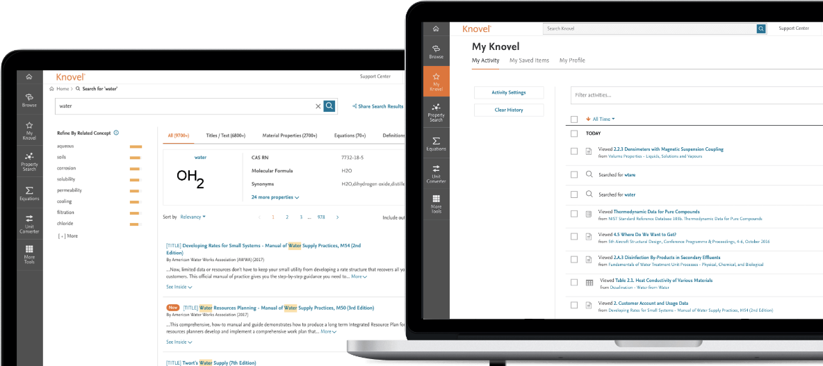
Knovel’s new design offers new ways to further tailor your experience through the MyKnovel features — so you don’t lose your pace when you’re looking for answers to engineering problems.

In redesigning Knovel, the team observed our customers at work, in their own environment, to better understand how they’re using Knovel, which product features are working and where we can do better. As a next step, we created simple wireframes for both experienced and inexperienced current customers to review – ‘testing’ our product enhancement assumptions to ensure that the redesigned Knovel would ‘speak’ to both – and then iterated based on their feedback. After each design iteration, we’d return to these customers and let them try out the latest version, as we continued to request feedback on what they liked and would change.
This data-driven process enabled us to make decisions about which platform changes would and wouldn’t be implemented. Finally, we created a prototype of the new Knovel; this Beta version was shared with 10 customers for their feedback, and we spent an hour with 30 new users to observe how they used it. The culmination of all of this feedback and data has resulted in the development of the new Knovel, designed around accessibility, user experience and user interface.
Consider “metal fatigue” as a real-world example of new Knovel’s improved search capabilities. In engineering, metal fatigue is the weakening of a material caused by repeatedly applied loads – but type the phrase into Google, and the vast majority of results are related to a video game of the same name. By rebuilding the Knovel platform using revolutionary technology that de-clutters the results, we’re getting better at finding the proverbial needle in a haystack; the new algorithm is much more complex, and much more refined, so engineers can search for something and quickly find exactly what they’re looking for. This is but one small sample of what Knovel’s new design can do.
Beta user of Knovel’s new design
Principal Engineer
Equipment Manufacturing Company

Request a free project quote
We will review your request and provide a project cost assessment within 1 — 2 working days.
Request a free project quote