linkedin

Case Study

Grace & Mercy

Grace & Mercy is a global leader in the rapidly evolving world of online ministry. Since 2006, this NYC-based Christian charity has provided insight and community to a global congregation. However, they were held back by a reliance on outdated technologies and a lack of design cohesion across their software applications.

grace and mercy case studygrace and mercy case study

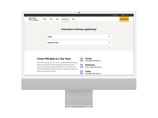
Redesigned Homepage for Public Reading of Scripture

Our Challenge

Create a uniform & intuitive user experience to serve different markets

Grace & Mercy wanted to better serve their worldwide audience, and approached DOOR3 to help replace their outdated UX/UI with a new, more consistent site design for their family of sites and applications. The new experience needed to be intuitive and supportive of their mission to serve a diverse, international user base.

We quickly discovered that the legacy sites’ code and manageability challenges would multiply the redesign project’s cost and time for Grace & Mercy. After reviewing options with our client, a joint decision was made to address technical issues in parallel with the redesign.

New Mobile Experience for Public Reading of ScriptureNew Mobile Experience for Public Reading of Scripture

New Mobile Experience for Public Reading of Scripture

Our Process

Provide a system that speaks to a diverse user base

Form and function are deeply related in digital products, and this proved true at Grace and Mercy. While the initial project concept was a design facelift, after a brief initial Discovery Phase we were able to provide Grace and Mercy with a clear perspective on the various design and technology factors that needed to be addressed in order to enable Grace and Mercy to efficiently deploy  - and efficiently maintain - a redesigned site.

Instead of piecemeal design changes across geographies, we proposed a unified design system that could be sustained despite the varied objectives of geographically and culturally diverse stakeholders. The positive impact of the new design system would have been limited, however, if we deployed it to an outdated platform. So, we undertook a legacy system migration of their multiple WordPress sites to a single-site, cloud-hosted Drupal solution with geographic localization, and regional and global content administration and workflow capabilities.  

As planned, the technical and UX tracks delivered more than the sum of the parts: The design system dramatically improved the user experience and reduced the effort and cost of the technical implementation, while technology modernization and unification focused organizational resources on a single robust, extensible, maintainable global platform, resulting in increased quality, reduced cost of ownership, and closer alignment among regional stakeholders as they worked together for a common cause. Command and control is a key success factor for any software project. DOOR3’s project management and governance framework delivered clear documentation, and integrated the UX and technology tracks while factoring in Grace and Mercy’s other dependencies. By providing executive visibility and agile project steering, we were able to fine-tune launch plans when our client’s strategic plans changed unexpectedly.

While many design agencies tend to eschew formal testing because “websites are simple,” DOOR3 recommended true Quality Assurance (QA) testing in light of the Grace and Mercy site’s extensive content workflows, multi-region administration, localization, and third party integration factors. This contributed materially to trouble-free delivery and our clients’ peace of mind. The value was so clear that Grace and Mercy opted to extend the testing process with Automated QA script development post-launch.

Public Reading of Scriptures Radio Page

Our Solution

Localized Experiences Delivered on a Global Platform

One challenge we faced was the sheer number of user profiles the site needed to serve, all with very different characteristics. We had to answer the tough question: how can the unified platform function globally while still being adaptable region-by-region?

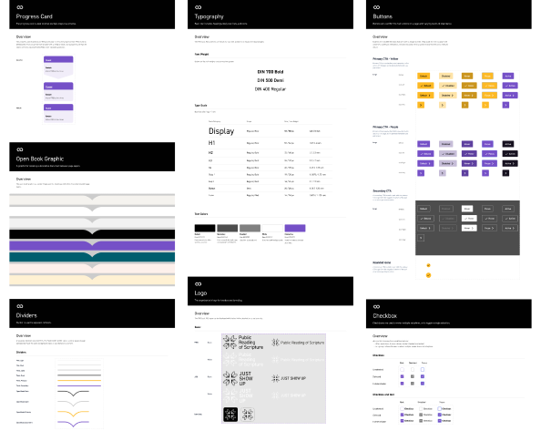
We leveraged the Grace and Mercy team’s diversity to conceptualize an array of experiences unified by their central vision. And we supercharged the design process from beginning to end by leveraging DOOR3’s brand-new white label design system. We redesigned the entire experience with an upbeat and friendly feel and a new color pallet, and the design system reliably seeded that sensibility across new and pre-existing site components.

The solution leveraged Drupal 9 on Amazon’s economical LightSail hosting platform. Drupal helped reduce development effort and time-to-market by providing the ability to manage users, permissions, and create various content with out-of-the-box configurability, workflow support, and security.

Pages from Grace & Mercy’s Design System

Conclusion

A brand new design system for a reimagined platform

By avoiding the trap of thinking of UX Design in isolation, the new global site addressed basic technical, design, and localization challenges, improved site economics and maintainability, encouraged innovation, and provided regional and global content owners with fine-grained control over structure and presentation of content. As a result, Grace and Mercy is now able to deliver nuanced and culturally-specific experiences that are of vital importance for engaging their congregants.

Door3.com