Understanding Responsive Design: When to Use it and When to Opt for Adaptive Design
08.02.2024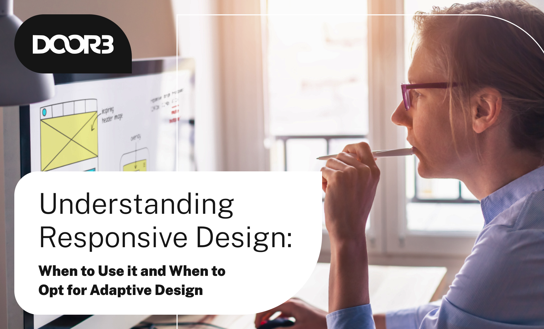
Understanding Responsive Design: When to Use it and When to Opt for Adaptive Design
Successful websites and applications must provide a seamless user experience and coherent design across different devices. Two common approaches to achieving this goal are responsive design and adaptive design. While both aim to enhance user experience, they differ in their implementation and suitability for various projects. In order to understand when to use which approach, we will discuss what responsive design really means, when it makes sense to use it, and when you might want to consider platform-specific adaptive design instead.
What is Responsive Design?
Since the early 2000s, designers have worked to create responsive website layouts that adapt to different browsers. Responsive design is an approach that ensures a website or application adjusts smoothly to different screen sizes and orientations, providing an optimal viewing experience across a wide range of devices. This is achieved using several techniques, including flexible grids, fluid images, and CSS media queries. Responsively designed content automatically reflows and rearranges itself to fit the screen size, whether it’s a desktop, tablet, or smartphone.
The core principles of responsive design include:
Fluid Grid Layouts: Unlike fixed grids, fluid grids use relative units like percentages instead of pixels. This flexibility allows elements to resize proportionally to the screen size.
Flexible Images: Images scale according to the size of their containing element, ensuring they don’t overflow the layout on smaller screens.
CSS Media Queries: Media queries apply different styles based on the characteristics of the device, such as its width, height, resolution, and orientation. This allows for specific adjustments to the layout and content for different screen sizes.
When Does Responsive Design Make Sense to Use?
Responsive design is generally the go-to approach for modern web development due to its flexibility and wide applicability. Here are some scenarios where employing responsive design makes the most sense: Wide Range of Devices: If your website or application targets a broader audience using various devices, responsive design ensures a consistent and user-friendly experience across all platforms.
Content-Driven Sites: For content-heavy websites like blogs, news portals, and e-commerce sites, responsive design allows content to be easily accessible and readable on any device, enhancing user engagement and retention.
SEO Benefits: Google and other search engines favor mobile-friendly websites. Responsive design, with its single URL structure and consistent HTML, helps improve search engine rankings and visibility.
Cost-Effective Maintenance: Managing one responsive website is generally more cost-effective than maintaining separate sites for different devices. Updates and changes need to be made only once, simplifying the maintenance process.
Future-Proofing: As new devices with varying screen sizes and resolutions continue to emerge, responsive design preserves your site’s adaptability and functionality without requiring extensive redesign.
What is Adaptive Design?
Adaptive design, first developed in 2011 by Aaron Gustafson, on the other hand, involves creating multiple versions of a website or application tailored to specific devices or screen sizes. Instead of a single layout that fluidly adjusts, adaptive design uses distinct layouts that activate based on predefined screen widths. This approach relies on breakpoints to deliver the appropriate design and content for each device category.
Key features of adaptive design include:
Predefined Layouts: Designers create multiple fixed layouts for different screen sizes, ensuring each version is optimized for its respective device.
Device-Specific Optimization: Adaptive design allows for precise control over the user experience on different devices, making it possible to tailor content and functionality to the unique capabilities and limitations of each device.
Efficient Performance: By serving only the necessary assets and layout for a particular device, adaptive design can improve performance, particularly on slower or less capable devices.
When Does Adaptive Design Make Sense to Use?
While responsive design is versatile and widely applicable, there are specific scenarios where adaptive design might be the better choice:
High-Performance Requirements: For applications requiring high performance and fast load times, adaptive design can deliver optimized assets and layouts, reducing load times and improving overall performance.
Complex User Interfaces: Applications with complex user interfaces and interactions, such as enterprise software or advanced web applications, can benefit from adaptive design. This approach allows for tailored experiences that leverage the strengths of each device.
Targeted User Experience: If your audience primarily uses a few specific devices, adaptive design lets you create highly customized experiences that maximize the potential of those devices. For example, a gaming platform might develop separate versions for desktops and tablets to ensure the best user experience on each.
Legacy Systems and Content: When dealing with legacy systems or content that doesn’t adapt well to responsive techniques, adaptive design offers a way to provide a suitable user experience without overhauling the entire system.
A/B Testing and Personalization: Adaptive design can be advantageous for A/B testing different layouts and personalized user experiences. By serving distinct versions to different user segments, you can gather insights and optimize the experience accordingly.
Comparing Responsive and Adaptive Design
To better understand when to use responsive design versus adaptive design, let’s compare the two approaches across several key factors:
1. Flexibility:
-
Responsive Design: Offers greater flexibility as it adjusts fluidly to any screen size or orientation.
-
Adaptive Design: Provides fixed layouts for specific breakpoints, which can limit flexibility but ensures optimized experiences for those breakpoints.
2. Development and Maintenance:
-
Responsive Design: Typically requires more initial development effort to create fluid grids and media queries, but simplifies long-term maintenance with a single codebase.
-
Adaptive Design: May involve more complex development and maintenance due to the need for multiple versions and breakpoints. Performance:
3. Performance:
-
Responsive Design: Can sometimes load unnecessary assets, potentially impacting performance on smaller devices.
-
Adaptive Design: Delivers optimized assets for each device, enhancing performance, especially on mobile devices.
4. User Experience:
-
Responsive Design: Ensures a consistent user experience across all devices, which is ideal for content-driven sites and broad audiences.
-
Adaptive Design: Allows for highly tailored experiences, beneficial for applications requiring specific device optimizations.
5. SEO and Accessibility:
-
Responsive Design: Generally better for SEO due to a single URL structure and consistent content, and it often provides better accessibility.
-
Adaptive Design: Requires careful handling of multiple URLs and content versions to maintain SEO and accessibility standards.
Making the Right Choice
Choosing between responsive and adaptive design ultimately depends on the specific needs of your project, target audience, and resources. Here are some guidelines to help you make the right choice:
Assess Your Audience: Understand the devices your audience uses and their expectations. If they use a wide range of devices, responsive design might be the best fit. For audiences with specific device preferences, consider adaptive design.
Evaluate Performance Needs: For projects where performance is critical, such as gaming or high-traffic applications, adaptive design can offer performance benefits. Responsive design can also be optimized for performance, but it may require additional effort.
Consider Content and Complexity: If your content and layout are relatively straightforward, responsive design can handle it effectively. For complex interfaces and interactions, adaptive design provides more control and customization.
Resource Availability: Responsive design often requires a single codebase, simplifying maintenance. If you have the resources to manage multiple versions, adaptive design can provide more tailored experiences.
Future-Proofing: Responsive design offers better future-proofing as it can adapt to new devices and screen sizes without major redesigns. Adaptive design might require updates as new breakpoints emerge.
Conclusion
Responsive design and adaptive design are powerful approaches for creating user-friendly websites and applications. Each has its strengths and best use cases. Responsive design is versatile, cost-effective, and ideal for broad audiences, while adaptive design offers optimized performance and tailored experiences for specific devices.
By understanding the principles and advantages of each approach, you can make informed decisions that align with your project goals and audience needs. Whether you choose responsive or adaptive design, the ultimate goal is to provide an engaging, seamless, and enjoyable user experience across all devices.
If you find yourself or your organization in need of any design help, including which approach to take, feel free to reach out to us here at DOOR3. We’ll put our expertise to work for you!
.png )
-e5e085.png )
-b762a6.png )
