Linking Tokens Across Components Using Figma | DOOR3
09.28.2024Linking Tokens Across Components: Using Design Tokens in Figma
As digital products expand and evolve, the ability to ensure uniformity across design components becomes increasingly challenging and crucial for success. Design tokens—formally defined, reusable design elements —are a solution that allows UX designers to streamline their workflows and automate their team’s design-to-development pipeline. One of the most effective methods for leveraging design tokens is by linking them across components within Figma, ensuring that any modifications to tokens are automatically propagated throughout all instances where they are applied.
This installment in our ongoing series delves into our field-tested approach to linking tokens across components in Figma, offering insights for UX designers seeking to enhance the maintainability and scalability of their design systems. If you haven’t read our previous installments in this series on mastering design tokens, read our series overview here.
Linking Tokens Across Components
As we’ve discussed in previous modules, design tokens are platform-agnostic name:value pairs that store design information, such as colors, typography, spacing, and shadows, and can alias to other name:value pairs. Linking tokens across your design system components frames them as a single source of truth, allowing designers to implement consistent styles across various components and platforms. However, in order to start, you should ensure your tokens and variables are compiled into a useful library.
Define Your Design Tokens
The first essential is to identify and define the design tokens that will be used across your design system. Common categories include:
- Colors: Define tokens for primary, secondary, and accent colors, as well as gradients and background colors.
- Typography: Create tokens for font families, sizes, weights, and line heights.
- Spacing: Establish tokens for padding, margins, and grid layouts.
- Shadows: Define tokens for elevation levels and shadow properties.
Tools like the Tokens Studio plugin for Figma can be used to create and manage these tokens directly within your design files. It’s important to structure these tokens logically, grouping them into categories that align with the needs of your project. If you’re new to creating design tokens, please review our previous post for a step-by-step approach using the Tokens Studio plugin.
Applying Tokens to Components Within a Design System
Once you’ve defined your tokens, the next step is integrating them into the relevant components of your design system. In Figma, this means selecting a component and assigning specific token values to its properties. For example, a button component might have its background color linked to a primary color token, the text linked to a typography token, and the padding connected to a spacing token.
By linking tokens to components, any changes made to the tokens will automatically reflect across all instances of that component, ensuring consistency and reducing the need for manual updates. We’ll use buttons as an example in this guide, but the same process can be applied to any component in your design system.
In this module, we’ll explain four different methods for linking tokens to components. We’ll focus on two recommended approaches, while also covering other alternatives for context.
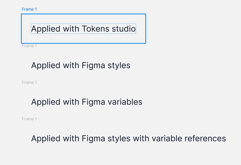
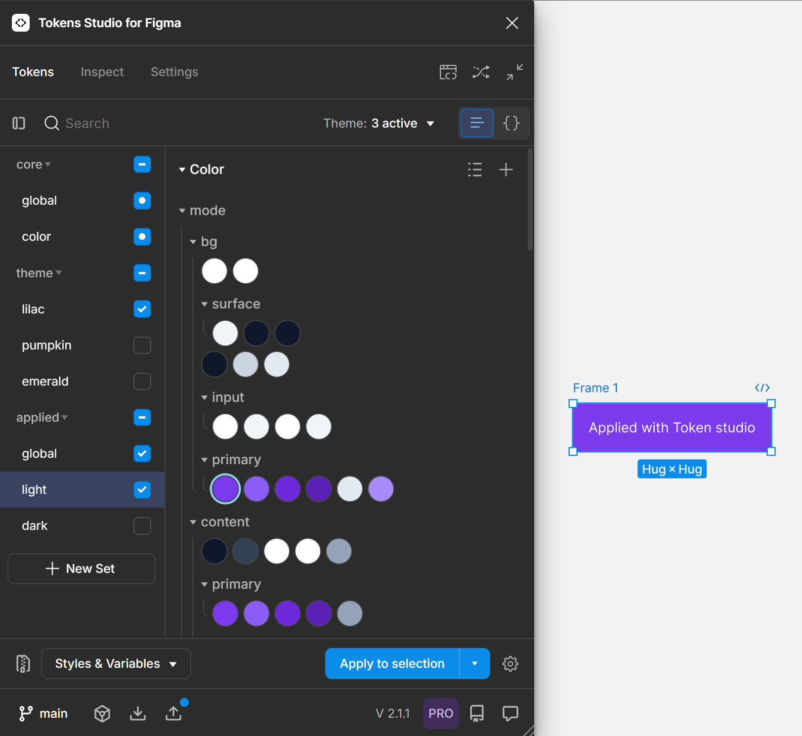
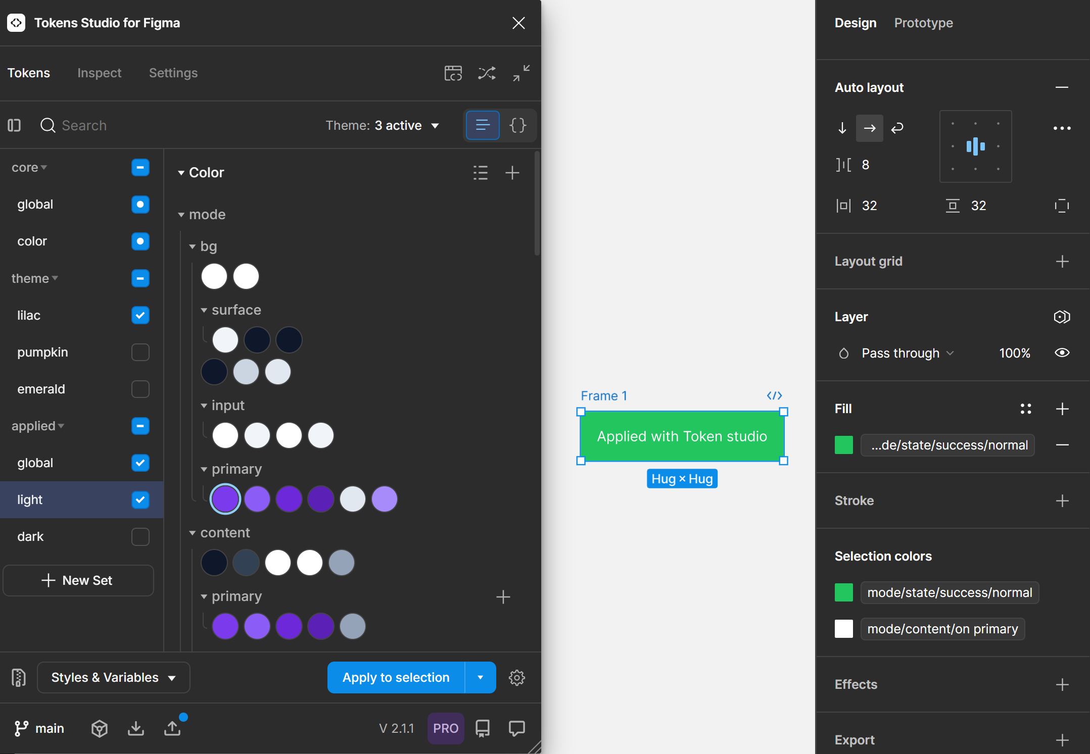
Method 1: Applying Tokens With Tokens Studio
- Select the button’s frame in Figma.
- In Tokens Studio, choose an applied token theme (e.g., light mode, primary tokens) and assign the corresponding colors or other properties, such as spacing or typography.
- For the button’s text, select the text element and choose the appropriate typography token.
- Once everything is assigned, click "Apply to Selection" in Tokens Studio.
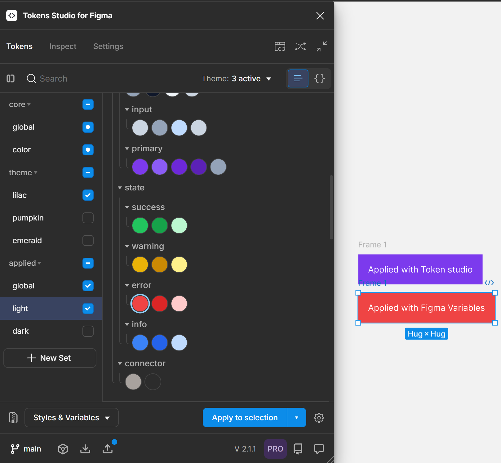
Method 2: Applying Tokens with Figma Variables
- Export your variables from Tokens Studio.
- In Tokens Studio, select “color” variables, choose the last two options, and then click "Confirm."
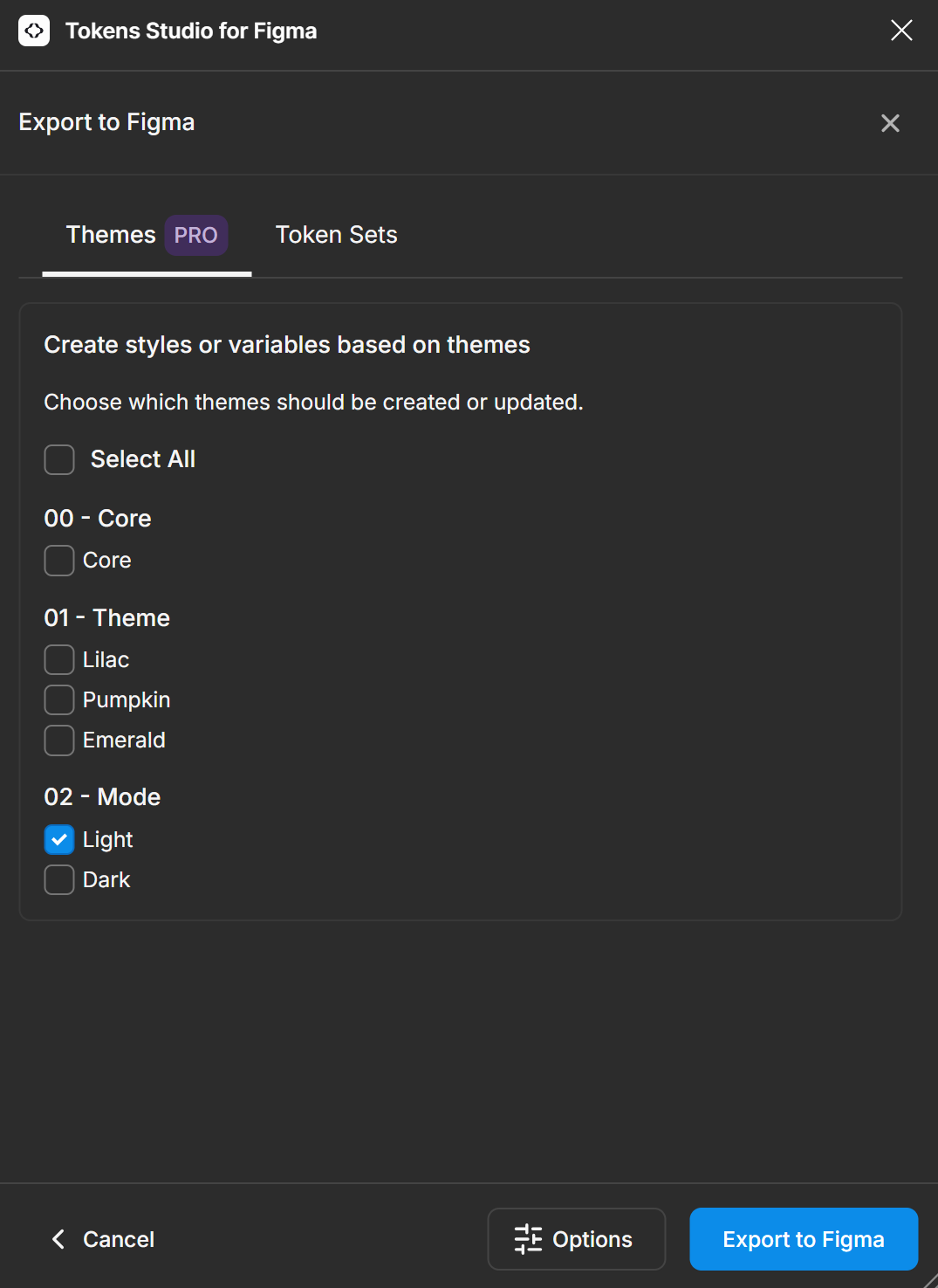
- In the “Export to Figma” modal, select only the tokens you want to surface in Figma and click export. Be sure not to export your reference tokens to avoid misapplication.
- Select your component in Figma and open the "Fill" options in the side panel.
- To access the tokens, click on the "styles and variables" library (represented by the four-dot icon).
- Choose the relevant variable (the same one used in Tokens Studio), and you will see the selected token appear in the Figma sidebar and in Tokens Studio.
- Repeat the process for the text, assigning the appropriate typography or color token.
Method 3: Applying Tokens With Figma Styles
- Export your styles from Tokens Studio.
- In Tokens Studio, select “color” styles, choose the last two options, and then click "Confirm."
- In the “Export to Figma” modal, select only the mode tokens and click export. Be sure not to export your reference tokens to avoid misapplication.
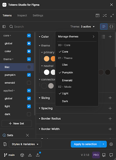
- When exporting styles in multiple modes, you’ll need to export each mode set separately because styles will not switch modes automatically. In the Manage Themes dropdown, select the mode you want, then export your styles. Repeat this process for each mode you want to set up.
Back in Figma, navigate to the “Fill” menu and scroll past the square icons for variables until you find the circular icons representing styles. Select the appropriate style token for both the frame and text.
Method 4: Applying Tokens with Figma Styles With Variable Reference:
In the “Export to Figma: Options” modal in Tokens Studio, select the option to “Create styles with variable references” and click “Confirm.”
This will create a connection between your styles and variables, so that your styles alias to your variables and will resolve as variables if you detach them.
.png)
In the following modal, select a single mode token to apply.
In Figma, apply the tokens from the “Fill” menu to both the frame and text as you would in the previous examples.
1.png)
Which Approach is Right for Your Team?
Each method for linking tokens has its own merits, but due to current limitations in Figma Styles, we strongly recommend the first two approaches, using either Tokens Studio or Figma Variables. This is because, when using Figma Styles, we encountered issues where tokens were not applied correctly in the Figma panel. Additionally, exporting tokens as styles multiple times can degrade the connection between Tokens Studio and Figma, leading to unpredictable results. For these reasons, we do not recommend relying on Figma Styles for token application at this time.
Let’s now explore the key advantages of the recommended approaches.
Advantages of Applying Tokens with Tokens Studio
Tokens Studio allows for seamless reapplication of tokens, even after changes have been made in Figma. For instance, if you delete styles or variables from a component in Figma, you can reload your tokens from Tokens Studio to revert back to the original design without losing consistency.
To illustrate this, try the following:
- Copy your components and delete all styles and variables from them.
- For components linked with Tokens Studio, use the “Inspect” tab in the Tokens Studio modal to see that tokens remain applied, even after changes in Figma.
- For the final two buttons, remove the “Styles” selections in the “Fill” section.
- Now, if you click these and select the “Inspect” tab in the Tokens Studio modal, you can see the first component still has tokens applied.
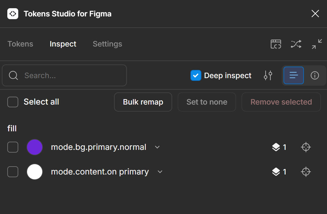
However, the rest of the buttons show no tokens are applied. So, if you go ahead and select all four of the buttons and click “Apply to Selection,” you’ll see the tokens reapplied to the component (button) that was applied with Tokens Studio and nowhere else.
This is why we recommend using Tokens Studio to apply your tokens if you want a stable connection between the two. This strong connection between Tokens Studio and Figma provides a stable foundation, especially when managing large design systems or frequent updates. It’s ideal for teams who want to centralize the control of component styling at the level of the design system.
Advantages of Applying Tokens With Figma Variables
Using Figma Variables to apply tokens offers a different approach that allows downstream designers more control and flexibility when styling components. Unlike Tokens Studio, where changes are driven from Tokens Studio itself, Figma Variables sync the token values from Figma to Tokens Studio. This approach localizes the application of tokens within Figma and gives designers the freedom to make changes to component styling.
In our first example, for our component applied with Tokens Studio, if we change the token in the Figma “Fill” menu, it will change the color or other styling to match in Figma, but the original token is still applied through Tokens Studio, so that when tokens are updated, the fill change will be overwritten.
- In our example, if you select the component using variables, change the option in the “Fill” menu, and click “Apply to Selection” in Tokens Studio, you’ll see that it syncs the two programs.
- By applying it as a variable, it changes the tokens in Tokens Studio. The changes are being driven by Figma, whereas in our previous example they emanate from Tokens Studio.
- If your team values direct control and collaboration through Figma’s interface, applying tokens as variables may be a better fit.
Both methods offer valid and powerful solutions for managing design tokens. The key is to decide which method aligns best with your team’s workflow and design system needs. Once you choose a method, commit to it for consistency across your organization. This will help avoid confusion, streamline updates, and ensure your design-to-dev pipeline remains efficient and effective.
Additional Recommendations
These approaches to applying tokens should cover your available options. However, there are some additional details that are worth considering if you want to master design tokens and all they offer.
Utilize Variants and States
Figma’s support for component variants and states allows for more granular control over how tokens are applied. Variants represent different versions of a component, such as a button in its default, hover, and active states. By linking tokens to these variants, you can ensure that changes to the design tokens are consistently reflected across all states of a component.
For instance, if a button’s hover state uses a slightly lighter shade of the primary color, you can link this variant to a token representing that shade. Any updates to the primary color token will automatically adjust the hover state, ensuring consistency without additional manual effort.
Organize and Manage Tokens
As your design system expands, managing a large number of tokens becomes complex. It’s crucial to organize your tokens in a way that facilitates ease of use and maintenance. In Figma, you can group tokens into categories such as “Colors,” “Typography,” “Spacing,” and “Shadows.” Within these categories, tokens can be further subdivided to reflect specific use-cases or design patterns.
Effective token organization not only simplifies the process of applying tokens to components but also makes it easier to update and scale your design system over time.
Test and Iterate
Once tokens are linked across components, it’s essential to test the system to ensure that changes propagate as expected. This involves making changes to tokens and verifying that these changes are accurately reflected across all instances in your design.
Testing should be an iterative process, allowing you to refine your token system based on feedback and real-world use. As your design system evolves, you may need to adjust existing tokens or introduce new ones to accommodate emerging design requirements.
Challenges and Considerations for UX Designers
While the benefits of linking tokens across components are significant, there are also challenges and considerations that UX designers should be aware of.
Managing Complexity in Large Systems
As your design system grows, the number of tokens can quickly become overwhelming. It’s important to establish clear guidelines for token creation, organization, and usage to prevent confusion and maintain the integrity of your design system. This includes defining naming conventions, categorizing tokens logically, and regularly auditing your token library to remove redundant or outdated tokens.
Ensuring Team-wide Adoption
For linked tokens to be effective, it’s crucial that all team members adopt the practice consistently. This may require training and onboarding sessions to ensure that everyone understands how to use tokens correctly. Providing clear documentation and guidelines can also help facilitate team-wide adoption and reduce the risk of errors.
Tooling Limitations
While tools like Figma and Tokens Studio offer robust support for design tokens, there may be limitations depending on the complexity of your design system. It’s important to evaluate your tools and workflows to ensure they can accommodate the specific needs of your project. In some cases, you may need to explore additional plugins or custom scripts to fully leverage the potential of linked tokens.
Conclusion
For UX designers working in complex, scalable design systems, linking tokens across components in Figma is an essential practice. It not only ensures consistency and efficiency but also facilitates collaboration and scalability. By following the steps outlined in this guide, you can implement tokens in your design system, streamlining your workflow and maintaining a high standard of quality across all aspects of your product.
As you continue to refine your design system, consider the long-term benefits of a well-structured token system. By investing in the practice of linking tokens, you’ll create a design system that is adaptable, efficient, and capable of evolving with the needs of your product and organization. If you’re interested in learning more about the power of design tokens, stay tuned to our ongoing series and check out our upcoming workshop.
.png )
-e5e085.png )
-b762a6.png )
