How To Create Design Tokens Using Tokens Studio: A Step-by-Step Guide
09.20.2024.png)
How To Create Design Tokens Using Tokens Studio: A Step-by-Step Guide
Design tokens are essential components of modern design systems, ensuring consistency and scalability across various digital products. They encode the core elements that define a design system’s visual language, including colors, typography, spacing, and more. Creating and managing design tokens effectively can make a significant difference in the quality and efficiency of your design process.
In this, the fourth part of our ongoing series, we’ll explore how to create design tokens using Tokens Studio. While you can create tokens directly in Figma, we recommend using Tokens Studio for Figma because it provides a more powerful toolkit for managing and applying your tokens in your design system. If you haven’t read the other installments of our ongoing series, check out the introductory overview for more information.
Understanding Design Tokens
Before diving into the tools and processes, it’s important to understand what design tokens are and why they’re so important.
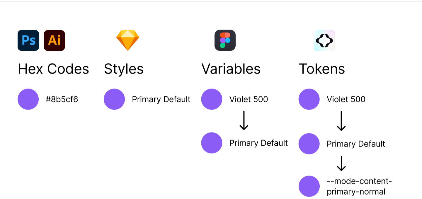
Design tokens are platform-agnostic name:value pairs that store design information and can alias to other name:value pairs. These tokens act as the building blocks of your design system, ensuring that design decisions are consistently applied across different platforms and devices. By using design tokens, you can create a single source of truth for your design language, which can then be easily implemented by developers.
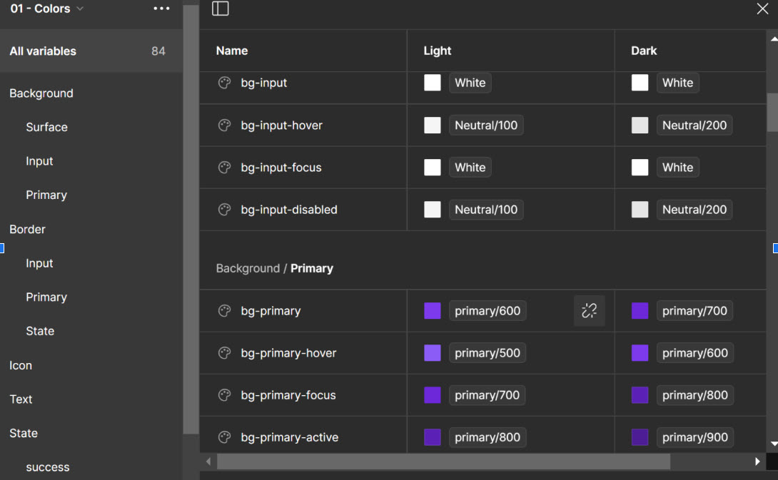
Figma Variables are Figma’s feature used to store and manage tokens for your design system. Variables can be applied to components directly, or be used as the underlying framework to build your styles. Once you create your tokens, you can export them to Figma and sync any changes as you continue developing them.
Why Design Tokens Matter
- Consistency: Design tokens ensure that your brand’s visual identity is applied consistently across all touchpoints.
- Scalability: As your product or brand grows, design tokens allow you to scale your design language without starting from scratch.
- Efficiency: By reusing tokens, designers and developers can work faster and more effectively, reducing the need for repetitive work.
- Flexibility: Design tokens make it easy to update and maintain your design system. Change a token’s value, and all instances where it’s used will automatically update.
Creating Design Tokens with Tokens Studio
Tokens Studio is a dedicated tool for creating and managing design tokens, providing more advanced features for complex design systems. Here’s how to create and manage design tokens using Tokens Studio.
Getting Started with Tokens Studio
Install Tokens Studio Tokens Studio can be integrated with Figma as a plugin. Install the plugin from Figma’s community plugins section.
Setting Up Your Project Create a new project in Tokens Studio. This project will serve as your central hub for managing all your design tokens.
Tokens Studio stores and exports your tokens as a single JSON file While we’ll explore using Tokens Studio with Figma, you can also utilize other third-party apps like Specify or Zeroheight to transform your tokens from your JSON file.
Creating and Managing Tokens in Tokens Studio and Figma
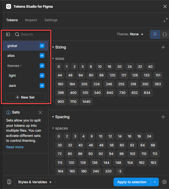
Step 1: Create and Define Token Sets in Tokens Studio for Figma
Tokens Studio allows you to categorize tokens in sets by type, such as colors, typography, spacing, etc. Start by defining categories that align with your design system.
We recommend utilizing a hierarchy to define different sets that serve the end goals of the design system. Foundational “reference” tokens can provide the basic guidelines, while other “applied” tokens aggregate basic building blocks and are attributed to components directly.
For example, in DOOR3’s design systems we utilize several categories:
Core Tokens are the basic building blocks of your design system and are used as reference points for the tokens applied to your components.
- Core tokens are foundational, but will not surface in your final designs. This streamlines the design process and reduces the risk of misapplication.
Theme Tokens are aliases of core tokens that allow you to create different groupings for different uses.
- Themes are especially useful because they facilitate modern UX design workflows. Global core tokens can be developed for brands or projects, organized into themes, and then are available for other designers to use without having to worry about the core tokens and their variables.
- Themes' iterative nature makes them well-suited for developing white-label products that can cut down on extensive production processes.
Mode Tokens can be set up at the semantic or component level, and are used to describe color variations between light and dark (or day and night) modes in an interface. They can also be used to categorize accessibility modes, like low- vs. high-contrast.
Applied Tokens are the tokens that get applied directly to components.
- These can include things like sizing, color, topography, and effects. However, it is up to you how you ultimately structure your tokens.
- We recommend this approach in order to maintain a separation between reference tokens (the underlying architecture) and the tokens which actually get applied to components. This helps simplify the exporting process and creates some guardrails for designers downstream.
- Applied tokens can be defined at either the semantic or component level. You can use your mode or theme sets as the applied sets to simplify the stack, but depending on the requirements of your design system, you might find a benefit in separating them out.
The benefit of this hierarchical approach is not only to keep your workspace uncluttered, but also to facilitate the multi-level workflows of complex team projects where multiple designers are responsible for different tasks. For example, a lead designer will often create the foundational core and alias tokens that comprise the themes used in a project. Then, downstream designers will be able to ideate within these themes without having to interact directly with Tokens Studio or the underlying token system generally.
Step 2: Create Your Design Tokens
While you will ultimately create individual tokens within specific token categories defined below, it’s important to familiarize yourself with creating them. You can follow general guidelines for tokens based on type:
- Color Tokens: Define tokens for primary, secondary, and accent colors.
- Typography Tokens: Define tokens for font sizes, line heights, and weights.
- Spacing Tokens: Define tokens for margins, paddings, and grid layouts.
Remember to apply your naming conventions from the beginning, so you develop a strong foundation for your tokens in the context of your design system. If you are unsure of how naming conventions should function, read our previous post here.
The token creation process in Tokens Studio takes place in the context of the specific structure and hierarchy you will format through the use of sets. In order to get the most from your design tokens, it is important to consider how you will structure your sets into themes. This will ensure you will be able to successfully export them from Tokens Studio to Figma and apply them to your designs.
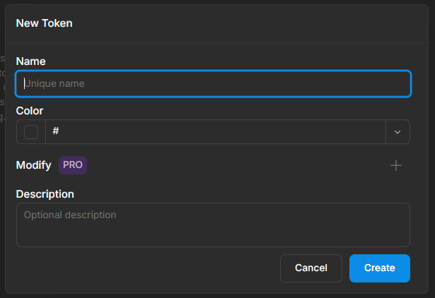
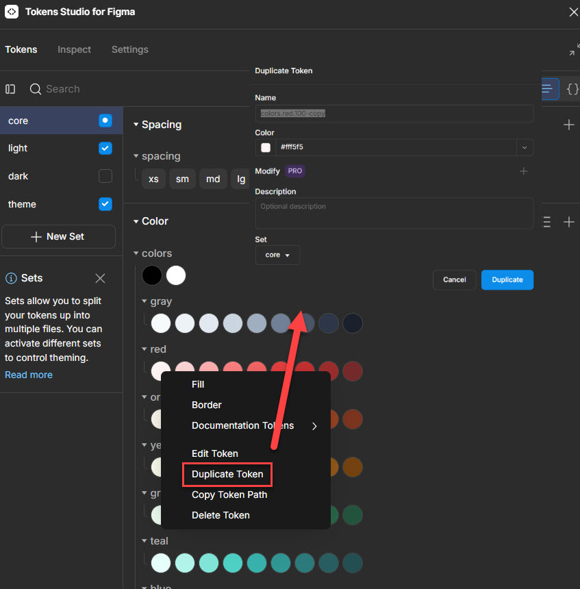
To start creating tokens, select the type you want by clicking the ‘+’ icon to view the “New Token” modal. In that form, fill in a name for your token and a value (in this case a hex code color). You can then create your token!
Once you familiarize yourself with creating different types of tokens, you can edit existing ones through the “Edit Token” option in the drop down. Here, you can also duplicate the token or other options. As your token sets expand, you can add more semantic buckets to organize them in groups.
Step 3: Applying Tokens as Themes to Components in Figma
Token Studio in Figma also allows you to access Themes on the fly from the Manage Themes dropdown.
We recommend using Tokens Studio for Figma with the “Apply to selection” setting in the bottom right of the Tokens tab to keep processing times to a minimum as processing the whole file can take some time.
To view components in either Light or Dark Theme, select the parent frame, then use the Figma Tokens plugin to switch between themes. The active theme lowest in the list will override the matching values in the themes listed above, but larger variant sets may take a moment to switch all elements to the chosen theme.
Note that this approach will not work if you have your tokens connected to Figma variables; if you’ve connected your tokens to variables, you’ll be able to switch themes directly in the Figma design panel.
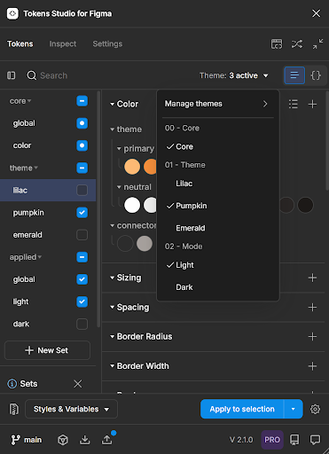
You can manage and create themes in a dedicated menu:
.png)
You can create your themes and customize them using the tokens you’ve created with a submenu’s controls:
.png)
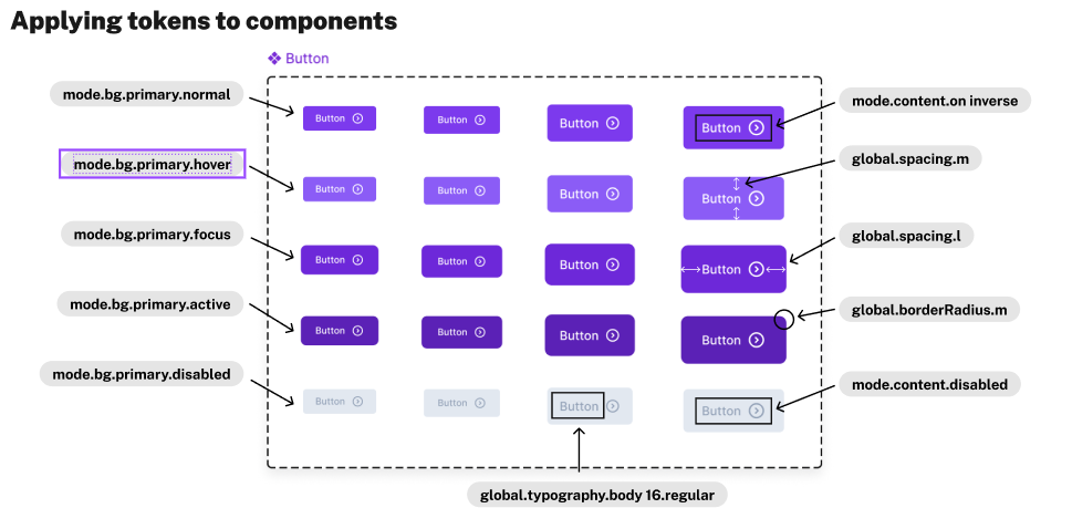
Understanding these controls is an essential part of exporting your tokens from Tokens Studio to Figma because you use these controls to designate how your sets should function when acting on a component. Remember, your core global tokens are used for reference only and should be marked as such. This allows them to function in the background while the applied tokens surface in the designs.
.png)
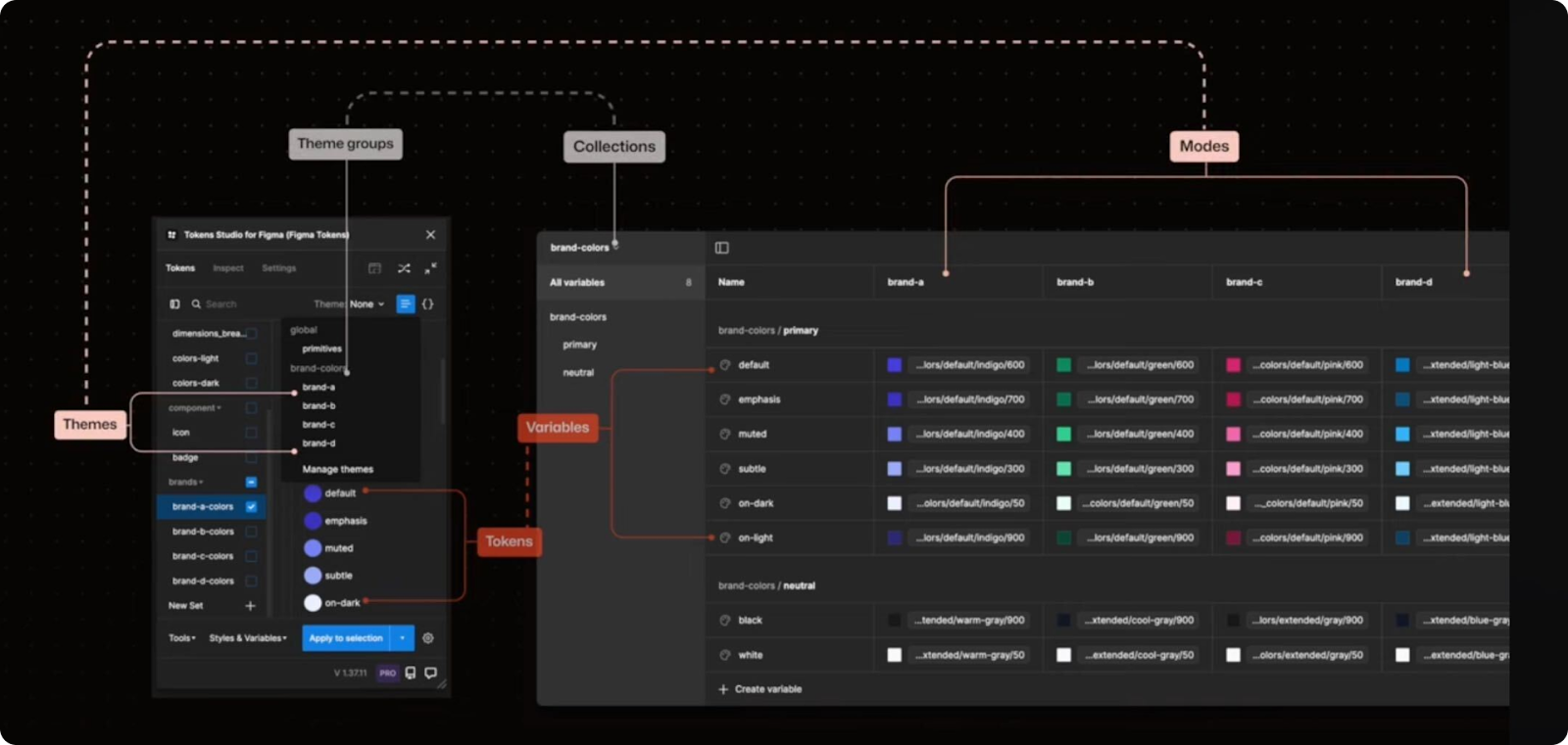
Defining your themes is key to successfully importing your tokens into Figma and applying them to your designs. This is especially true in practice, as themes invariably become complex. For example, if you switch to view the Figma variables in one of our example themes, you see it is composed of dozens of variables:
.png)
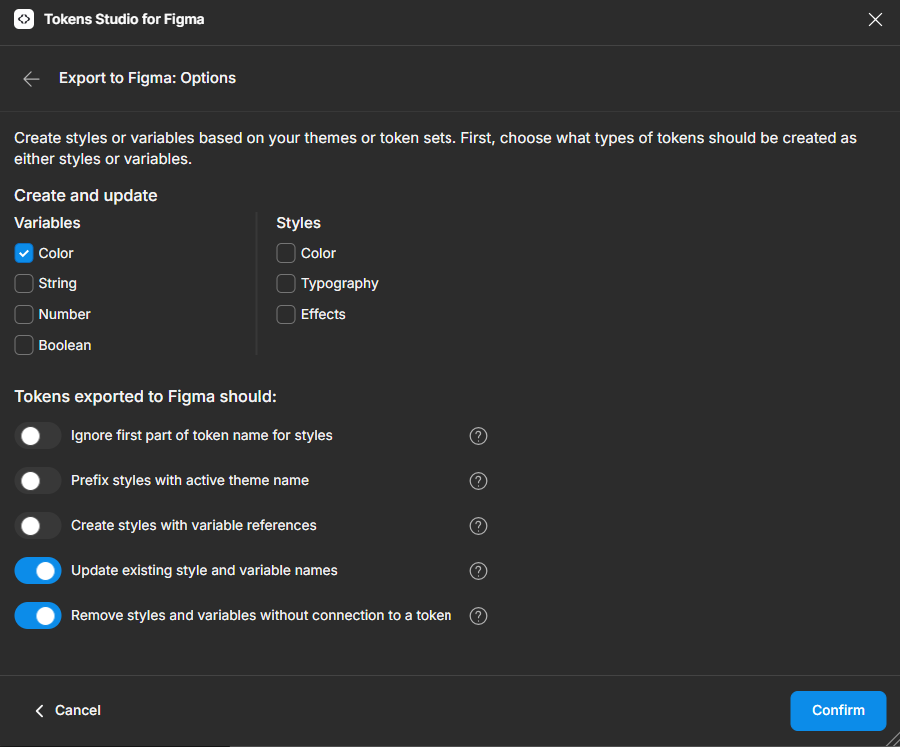
Step 4: Exporting tokens to Figma
Once you’ve created your tokens in Tokens Studio, you can export them into Figma as styles or variables in order to surface them for other designers in the Figma design panel.
In the “Styles & variables” menu, select “Export styles & variables.” Check the variables and options you want to export. By selecting the last two options, “Update existing…” and “Remove styles…” you can ensure that any updates made to tokens in Tokens Studio are reflected in your Figma files.
After you confirm and select what sets to update, you can return to Figma to see your updated themes and variables. Note that there are some differences in terminology between Tokens Studio and Figma:
- In Tokens Studio, the individual groups of tokens are called “sets” which are then grouped into Figma “themes.”
- However, what Tokens Studio calls “**sets**” are “**modes**” in Figma.
- Lastly, Token Studio “**themes**” map to “**collections**” in Figma.
It seems confusing, we know. Once you familiarize yourself with this process, however, you’ll find the connection fairly intuitive.
Step 5: Publish your changes in Figma
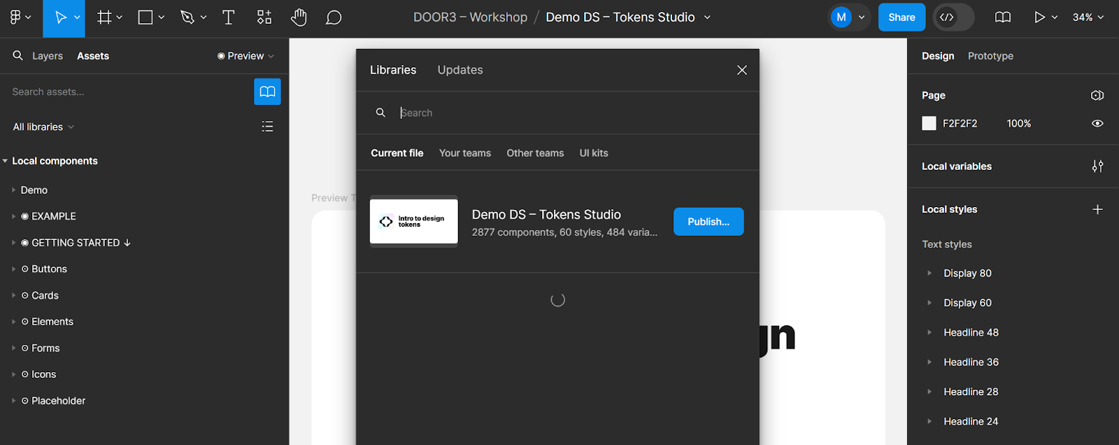
Once you have developed and integrated your design tokens into your design system, you will want to publish the changes across your designs. To do this, you will need to open the Library menu in Figma and publish your changes.
From this point on, the workflow should be familiar to any designer who’s comfortable in Figma. The tokens that you’ve set up are connected to your styles, variables, and components, and your design system is poised for greatness.
Advanced Token Management
Once you have mastered the process of creating, exporting, and publishing your tokens, there are still more skills to learn on your way to building your own design-to-dev pipeline. We will cover more in future posts, here’s some examples.
Manage Responsive Tokens Tokens Studio supports responsive design by allowing you to define tokens that adapt based on screen size. This ensures that your design system is scalable and flexible.
Export Tokens for Development Once your tokens are set up, there are other tools available to transform your JSON into a format (e.g., XML, CSS) that can be easily integrated into your development workflow. This ensures that the design tokens are implemented consistently in code and will stay in sync with design assets in Figma.
Choosing the Right Approach for Your Team
Both Figma and Tokens Studio offer robust tools for creating and managing design tokens. Figma is excellent for designers who want to manage tokens directly within their design files, while Tokens Studio provides advanced features and greater control over token management, making it ideal for larger, more complex design systems.
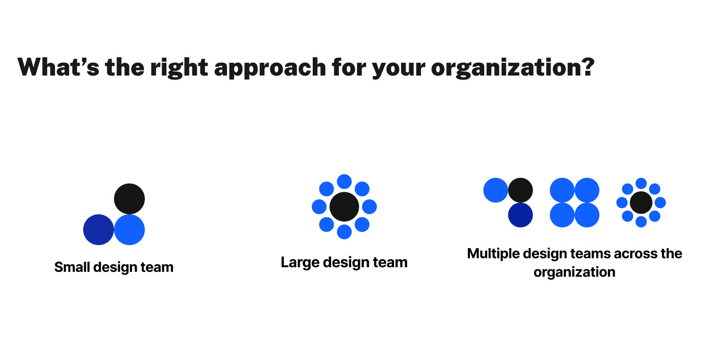
When choosing the right tool, consider the size and complexity of your design system, your team’s workflow, and how closely you need to collaborate with developers. Is your team small or large, or are you working with multiple design teams across an organization? As organizations scale up, the risks of design redundancies and inconsistencies grow larger, as does the misapplication of tokens.
A simple token schema that’s well-defined and clearly named based on real-world use cases will provide the most value, while also encouraging widespread adoption. Whether you opt for Figma, Tokens Studio, or another tool, investing time in setting up your design tokens will help your designers and developers ship better products, faster.
Stay tuned for our next installment in our ongoing design tokens series covering how to integrate your tokens into development workflows.
.png )
-e5e085.png )
-b762a6.png )
